Simple layout, why not?
 tech
tech
 web
web
 news
news
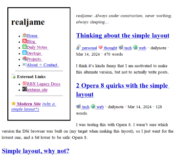
I made an alternate, minimal version of my website. You can find it on the sidebar, or head to simple.realja.me.

Now, you can read my website on practically any web browser and device ever made!

Pretty simple
It was surprisingly easy to do: my website is generated using a static site generator, so I was able to make an alternate “theme” (layout) for it with new HTML and CSS.
And to achieve this look, I deleted the complex CSS files. I made a new one that clocks in at just over 40 lines to do the bare minimum: separate the sidebar, center things, etc.
It really is that easy. A lot of things degraded nicely, such as the icons having exactly the same effect.
I also had to convert my SVG icons to PNG icons, because old browsers don’t support those.
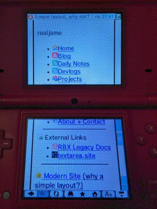
Another thing was resizing my images to a max horizontal width of 512 pixels. This isn’t necessary, but it helps really weak devices (like the Nintendo DSi) keep from running out of memory and crashing.
Then, simplifying the HTML files because I don’t need to structure it for styling anymore, and it’s done!
But… why?
The main reason is because I wanted my blog to be available on the Nintendo Wii and DSi web browsers. Those are based off of Opera 9, a version from 2006.
I also thought it would just be neat to have my website be really accessible, because sites like Razorback (RIP, hope it returns someday), The Old Net and others that are designed for 90s computers and browsers like Internet Explorer 2… I just think they’re neat!
In the future
I don’t know how good I will be at keeping this layout in sync, it’s not an automated thing at all. Any changes I make to one, including new posts, I have to do manually to the other. But this is pretty simple to do, I just need to remember to do it. :^)
See also
More posts I wrote about the simple layout:


